Improving Community Platform Usability
Nextdoor UX Research & Design Case Study
Role
Product Designer,
UX Researcher
Duration
8 weeks (June 2025 -
August 2025)
Team
Solo (personal project)
Software
Figma, Zoom, PowerPoint,
Excel, Airtable
Usability Testing, A/B Testing, Heuristic Evaluation, Competitive Analysis, In Depth Interviews, Persona Development, Affinity Diagram, Prototyping
Problem Statement
"How might we reduce information overload and improve usability for Nextdoor's diverse user base, particularly older adults, to foster meaningful neighborhood connections?"
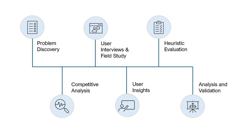
User Research
I designed a mixed-methods approach combining digital in-depth interviews with online survey questions to understand both actual usage patterns and stated user needs.
Why this method: Traditional usability testing wouldn't capture the real-world context of neighborhood platforms. I needed data showing how information overload develops over weeks of usage, not using it for a small amount of time.
Recruitment
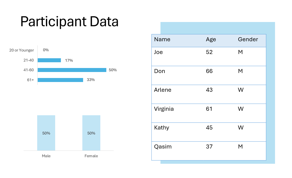
I recruited through the platform itself to ensure participants were authentic users. In turn, I got greater and more in-depth insights about actual community dynamics and usage motivations. I interviewed 42 individuals through digital surveys, and 8 participant interviews conducted on Zoom.
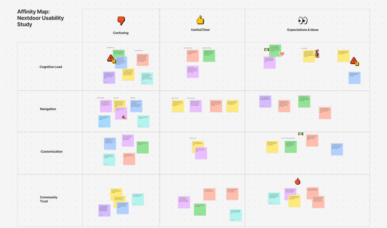
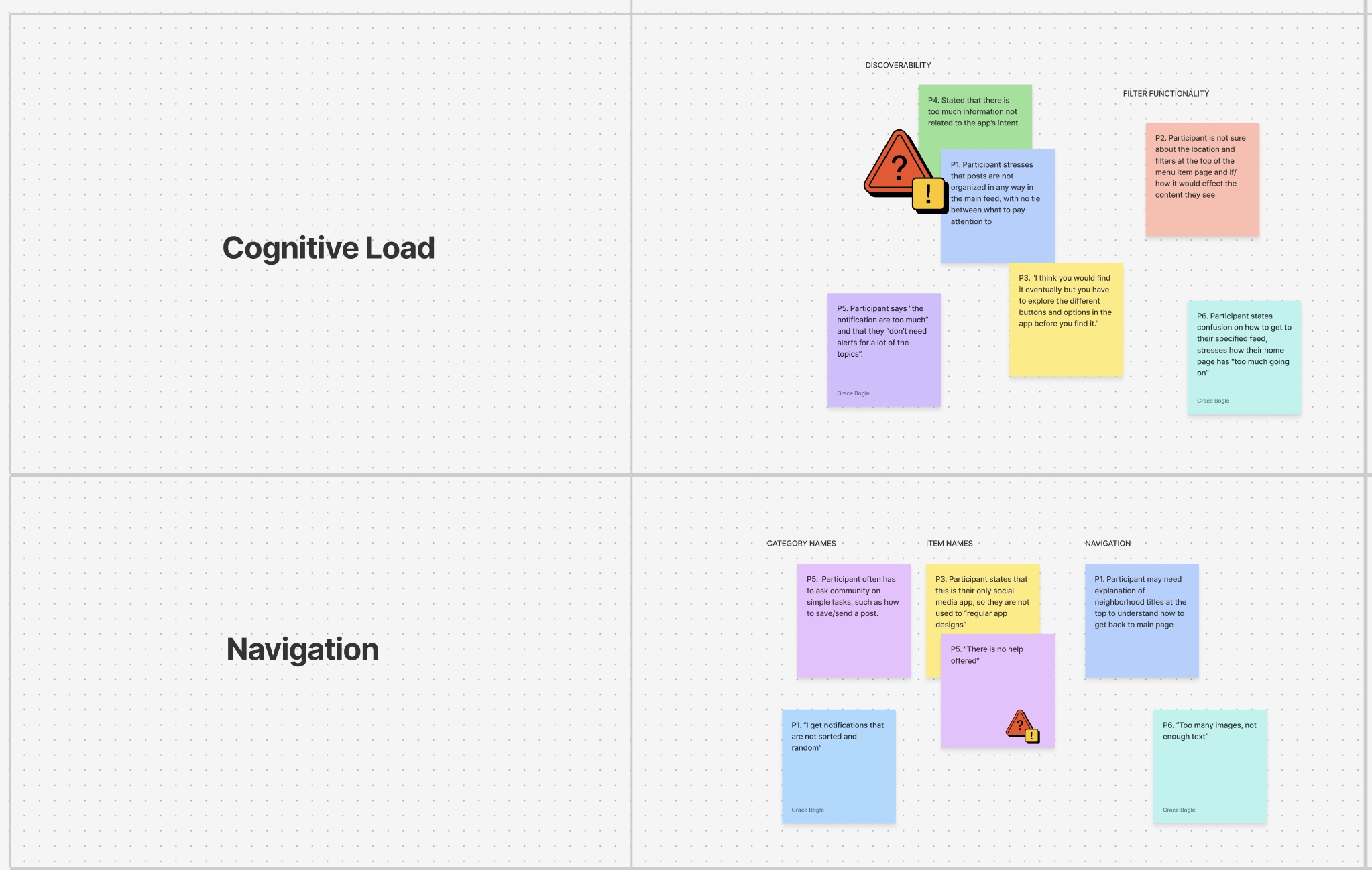
Affinity Diagram
After collecting qualitative data from 6 participants over multiple weeks, I needed a way to identify patterns across diverse user experiences and usage contexts.
Why this method: With longitudinal data spanning different user types, ages, and tech comfort levels, I couldn't rely on frequency counting. The affinity mapping process allowed me to look at complex feedback and quotes and group them into themes while showing the emotional context behind user frustrations.
Outcome: The affinity mapping revealed that user problems were from specific system failures. For example, poor content filtering led to navigation avoidance, which reduced user control, ultimately lowering the community value.
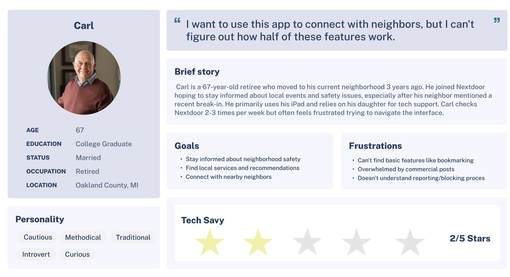
Persona Development
From the affinity mapping patterns, three distinct user archetypes emerged that represented different relationships with technology and community engagement priorities. Each persona represents a different way users cope with Nextdoor's current limitations and has distinct implications for design solutions.
I prioritized 'Carl' as the primary persona because he represents Nextdoor's core demographic challenge, which are older adults who want community connection but struggle with interface complexity. Each persona was validated against actual participant quotes and observed behaviors, ensuring they reflected real user needs rather than design team assumptions about the user base.
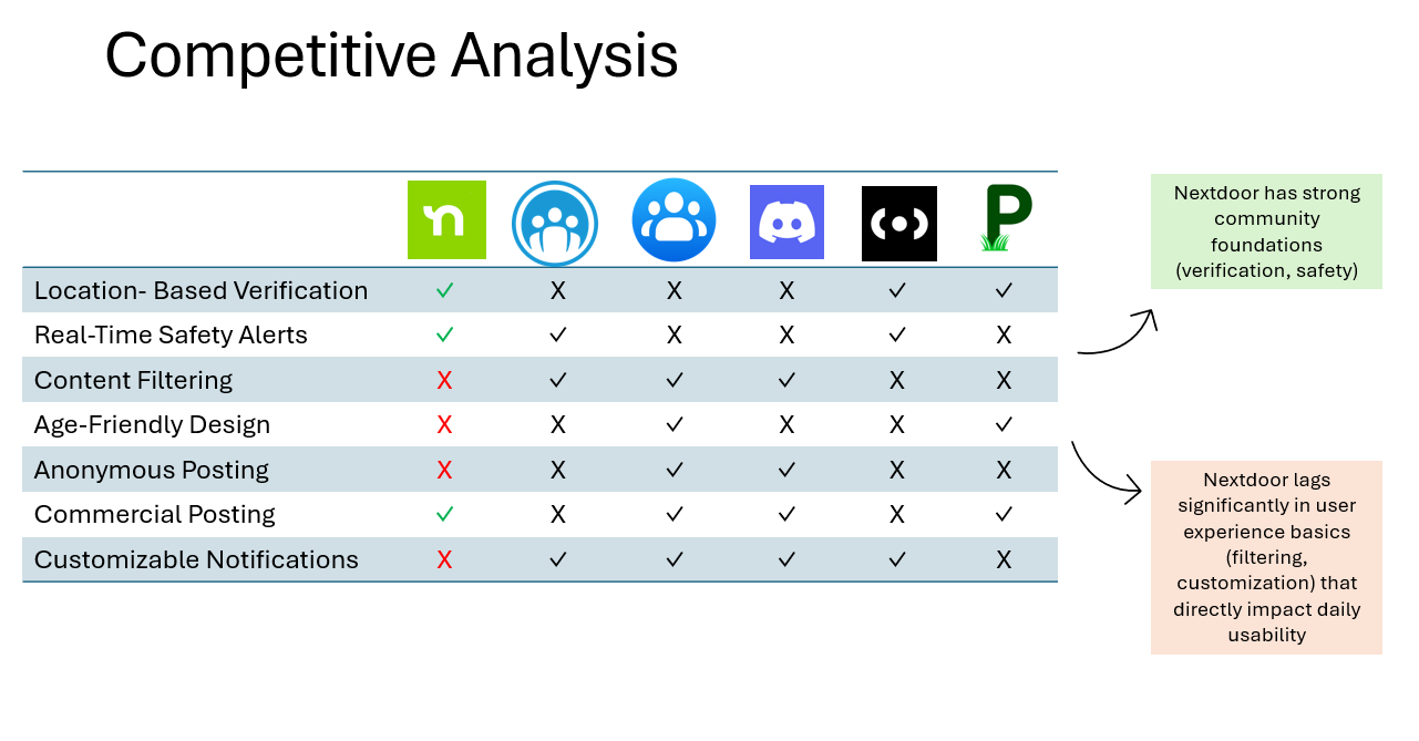
Competitive Analysis
Then, I analyzed six community platforms to understand where Nextdoor's user experience advantages and gaps created competitive opportunities. I focused on identifying UX patterns that either supported or hurt community engagement.
What I found: Community platforms succeed when they balance user control with content discovery. I evaluated how each competitor handled information filtering, user onboarding, and trust-building. The analysis revealed that Nextdoor's verification-first approach creates trust but sacrifices user experience basics that newer platforms prioritize.
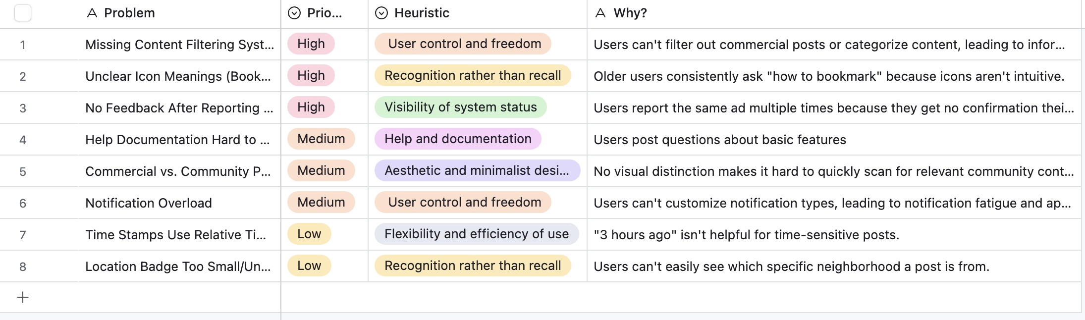
Heuristic Evaluation
I conducted a heuristic evaluation to understand the pain points that the interviewees faced when using Nextdoor. This allowed me to separate identified problems from real user issues during.
Why this method: By evaluating against established usability principles, I could distinguish between theoretical violations and actual user impact. I focused on three user journeys where my preliminary research suggested the most problems: onboarding flow, content discovery, and notification management.
I prioritized violations to place attention on high-priority issues that interfered with Nextdoor's business goals. This approach prevented bias toward obvious visual problems while looking at the deeper interaction issues.
Research Synthesis & Problem Definition
After analyzing interview transcripts and usablity observations, a clear pattern emerged: users approach Nextdoor with specific, goal-oriented intentions—safety updates, local commerce, community help, and neighborhood connection. However, the communication-driven nature of the platform means most user engagement begins with notifications and replies.
Key insight: Users consistently reported "endless notifications" that couldn't be customized or filtered, creating information overload that prevented them from accessing the content they actually valued.
This led me to focus on notification management as the primary intervention point for improving user experience.
User Journey Analysis
I mapped Carl's current experience navigating to notification settings, which revealed critical pain points:
- Difficulty locating settings access
- No clear path to customize notification types
- Overwhelming volume of irrelevant alerts
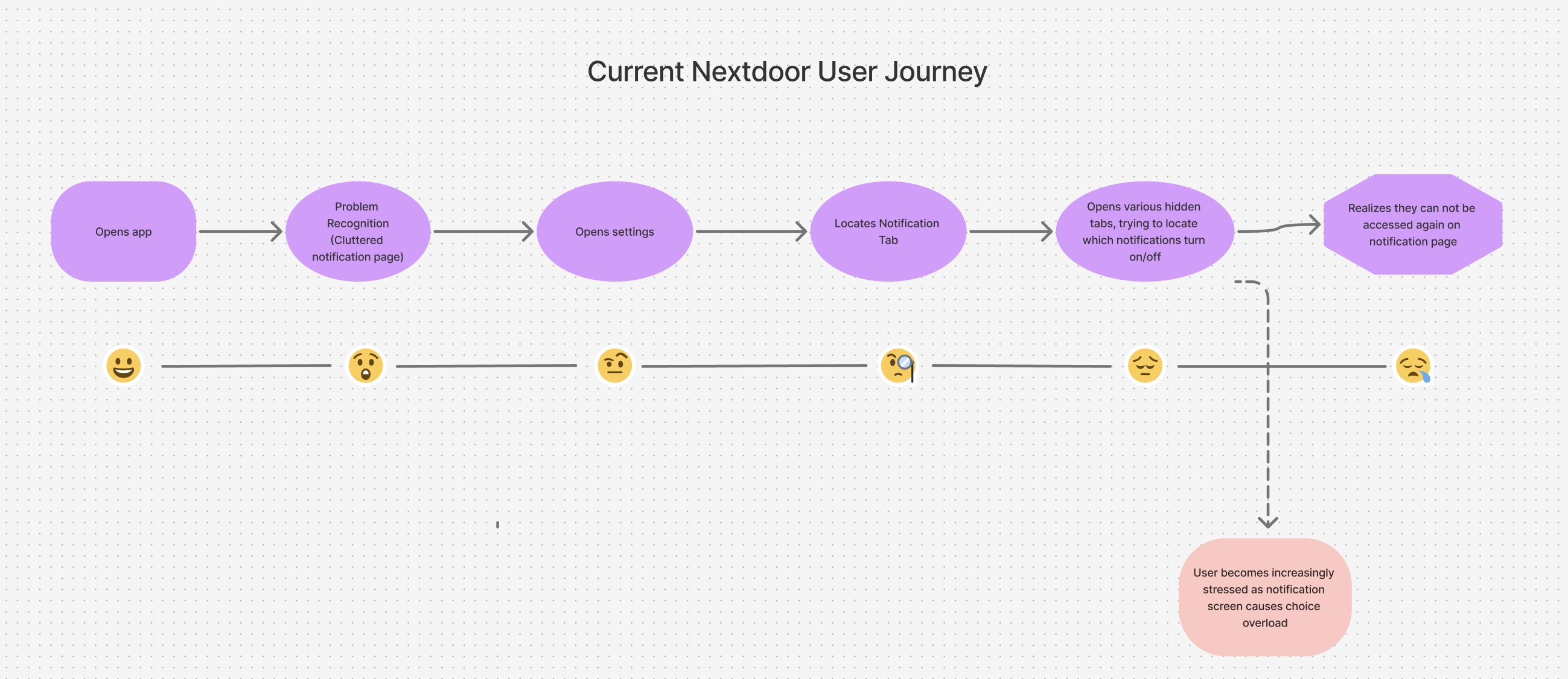
To address these issues, I redesigned the user flow prioritizing:
- Clear, accessible settings entry point
- Notification control
- Immediate implementation on user actions
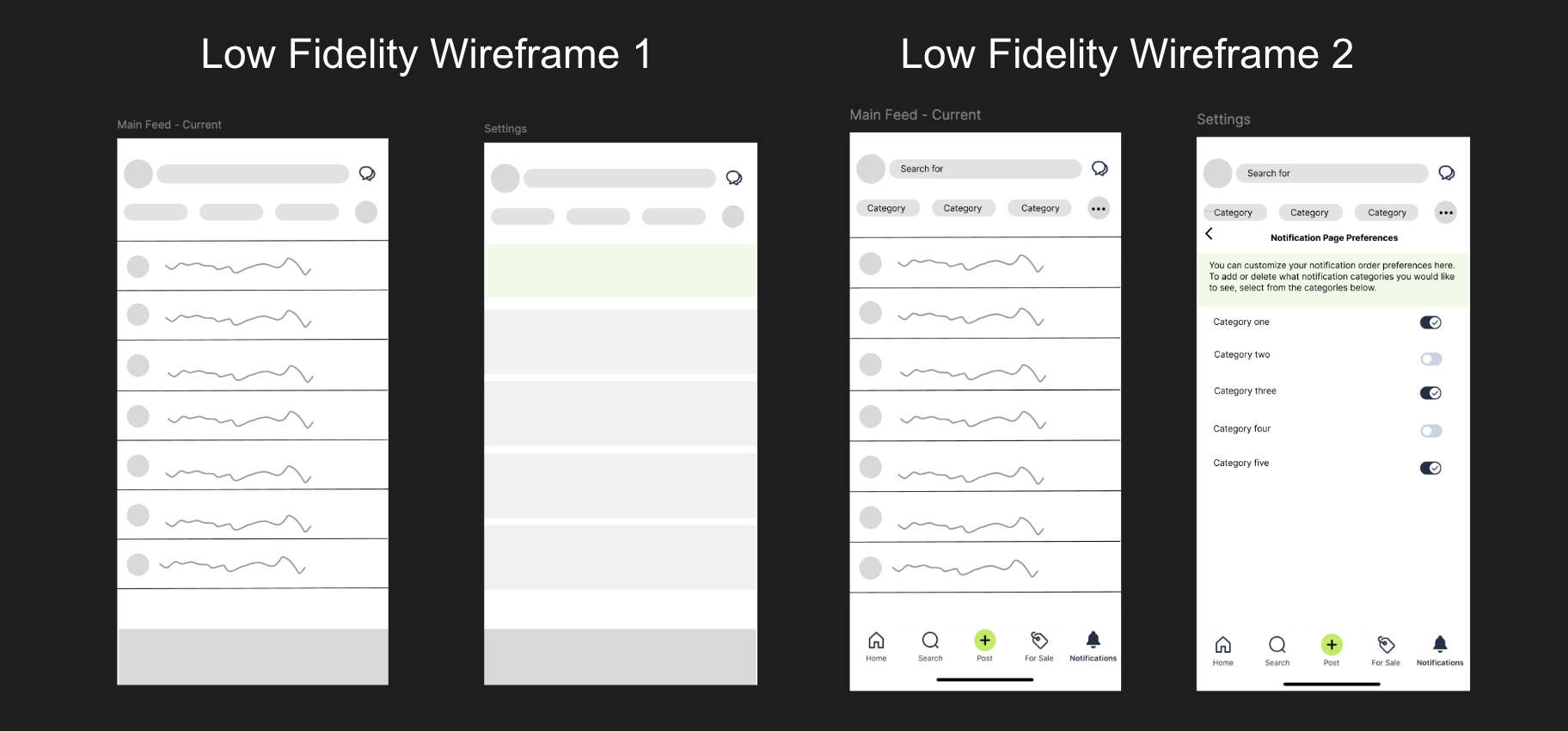
Low Fidelity Prototype Development
User Feedback A/B Testing and Jakob's Law
I conducted follow-up interviews with 5 participants to validate design decisions through A/B testing:
User Interview and Feedback: gear icon vs. ellipses icon
During the 20-minute sessions, I asked participants to complete the task of "customizing their notification preferences" while thinking aloud about their decision-making process. Participants were shown both icon options and asked to explain which felt more intuitive and why.
Results: 83% of participants (5 out of 6 testers) expressed a clear preference for the gear icon over the ellipses option. When prompted to explain their reasoning, participants mentioned that the gear "obviously means settings" and felt "like every other app I use."
Design Rationale
This finding validated my application of Jakob's Law, which states that users spend most of their time on other sites and prefer interfaces that work similarly to those they already know. By choosing the gear icon, I leveraged users' existing mental models from other applications, reducing the cognitive load required to navigate the interface.
High Fidelity Development using Hick's Law
In developing the high-fidelity prototype, I applied Hick's Law, which states that the time it takes to make a decision increases with the number of available choices. This principle was relevant for my target demographic because older users often experience high cognitive load when faced with complex interfaces.
Notification Categories
Rather than presenting users with a long, overwhelming list of notification types, I reduced the options to five clearly defined categories: Alerts, Trending, Replies, Groups, and Promotions. This reduction from the platform's original scattered notification settings to five distinct categories decreased decision time while covering all essential use cases identified in user research.
Toggle Interface Design
I implemented simple on/off toggle switches instead of dropdown menus or multiple-choice options. This binary choice system minimizes cognitive processing time and aligns with users' mental models from other familiar interfaces like smartphone settings.
Progressive Disclosure
Instead of showing all notification settings simultaneously, I created a clear hierarchy where users first access the main settings screen, then navigate to specific notification preferences.
Visual Hierarchy
I used visual design elements, like contrast, spacing, and typography, to guide users toward the primary actions while de-emphasizing secondary elements. This visual prioritization reduces the cognitive effort required to identify the most important interface elements.
Impact on User Experience: By applying these Hick's Law principles, the interface allows users like Carl to complete their notification customization task in 2-3 decision points rather than navigating through multiple nested menus. This addresses the information overload problem identified in the original research.
Key Takeaways
Longitudinal Research Proves Essential
Traditional usability testing would have missed the cumulative effect of information overload that develops over weeks of app usage. The 8-week longitudinal study revealed behavioral patterns that can only be seen through sustained observation. This reinforced the importance of matching research methods to the actual user context rather than defaulting to quick usability sessions.
User Empathy for Generations
While older users faced navigation challenges, the research revealed that comfort with digital interfaces matters more than chronological age. Some 60+ users navigated complex features easily, while some 40+ users struggled with basic functions. This challenged my assumptions about age-based design and highlighted the importance of designing for varying levels of digital fluency rather than demographic categories.
Content Categorization Drives Engagement
Clear visual distinction between content types (safety alerts vs. promotional posts) were seen as more important than chronological organization. Users need to quickly assess relevance rather than recency, especially for neighborhood-focused platforms where the content's urgency varies dramatically.
Familiar Patterns Reduce the Learning Curve
Users rely heavily on interface conventions learned from other apps. For older users especially, leveraging existing mental models from mainstream platforms reduces the cognitive effort required to learn new interfaces.
View More Projects
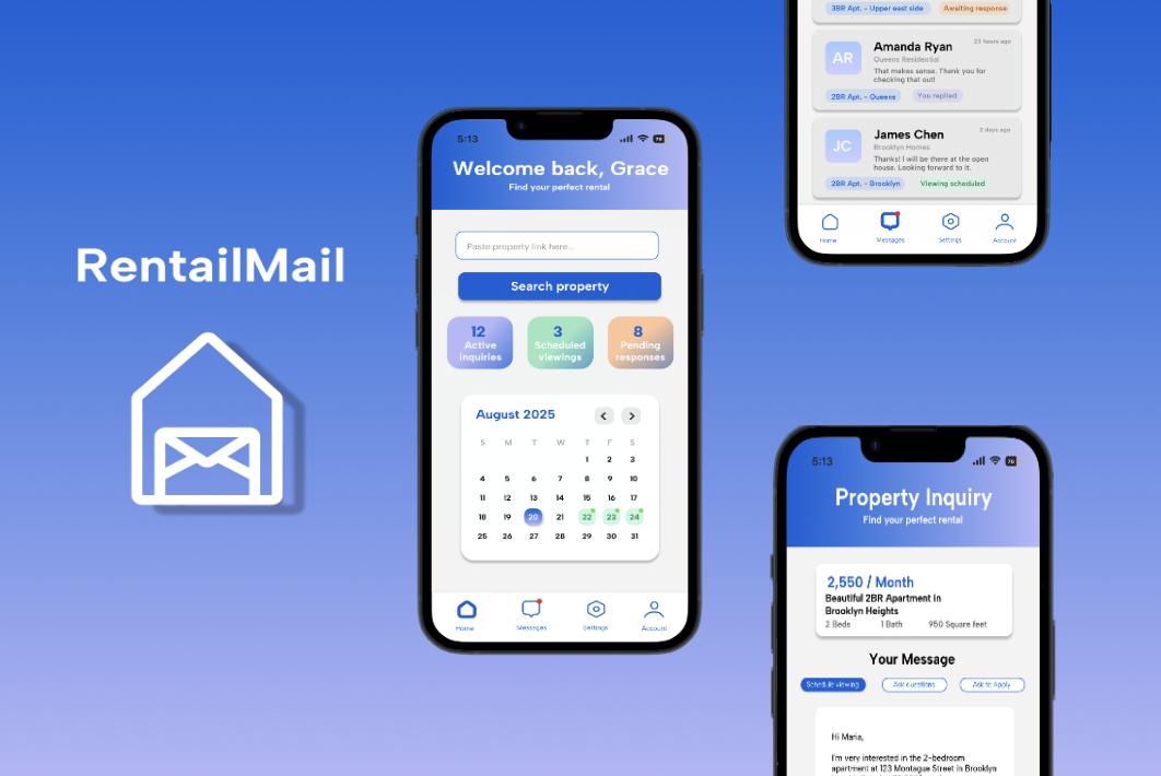
Designing an Easy Rental Experience
Mobile UX design focused on reducing stress in rental communications through automated messaging and scheduling.
View Project
Patient Portal User Research & Insights
Healthcare UX research combining ethnographic interviews and quantitative analysis for digital medical portal optimization.
View Project
Accessibility Audit Case Study: Zingerman's Deli
Comprehensive WCAG 2.1 compliance assessment and digital inclusivity analysis for local business website.
View Project