Designing an Automated Outreach Approach to Renting
RentailMail UX Research & Design Case Study
Role
Product Designer,
UX Researcher
Duration
6 weeks (June 2025 -
August 2025)
Team
Solo
Tools
Figma, Miro, Maze
Quantitative Surveys, Journey Mapping, Usability Testing, A/B Testing, Competitive Analysis, Persona Development, Affinity Diagram, Low and High Fidelity Prototyping
Why This App
RentailMail addresses the need for efficient, personalized rental property outreach in the competitive housing market. This app is to be created for those who need to find rental properties, along with needing help with the first outreach, messaging, and scheduling. Renters need communication tools that reduce stress in the rental process while maintaining timely connections.
Problem Definition
Why this is a problem
Negative emotions toward cold outreach and time constraints create barriers in rental communications.
- Renters feel overwhelmed by impersonal, generic outreach that doesn't address their specific needs
- Time-sensitive nature of rental markets needs immediate and organized communication
How can this be fixed?
- Easy to use, mobile based design focused on scheduling and communication
- Mobile interface optimized for on-the-go rental searching and communication
- Automated scheduling integration to eliminate back-and-forth coordination
- Messaging templates that maintain authentic tone while saving time
Design Process
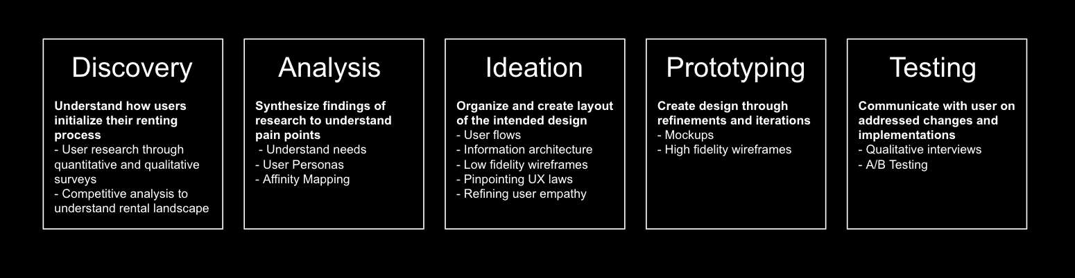
Project Preparation
Research Goal Brainstorming
First, I needed to understand the pain points and motivations in rental communication processes to design a solution that bridges the gap between efficiency and personalization.
- How do current rental outreach methods impact user emotions and decision-making?
- What scheduling and organizational tools would most effectively support rental workflows?
- What communication preferences exist among different rental markets?
Competitive Analysis
I then went on to analyze existing rental platforms, communication tools, and scheduling applications to identify gaps and opportunities.
- Traditional rental platforms (Zillow, Apartments.com, Craigslist)
- Communication-focused tools (rental-specific messaging platforms)
- Scheduling applications integrated with real estate workflows
Three Key Learnings
Separated Experience
Most platforms separate searching, communication, and scheduling into different tools, creating workflow inefficiencies.
Generic Messaging
Current solutions rely heavily on templated responses that feel impersonal and reduce engagement rates.
Mobile Gap
While users search on mobile, communication tools are often made for the desktop which can create friction in the user journey.
User Research
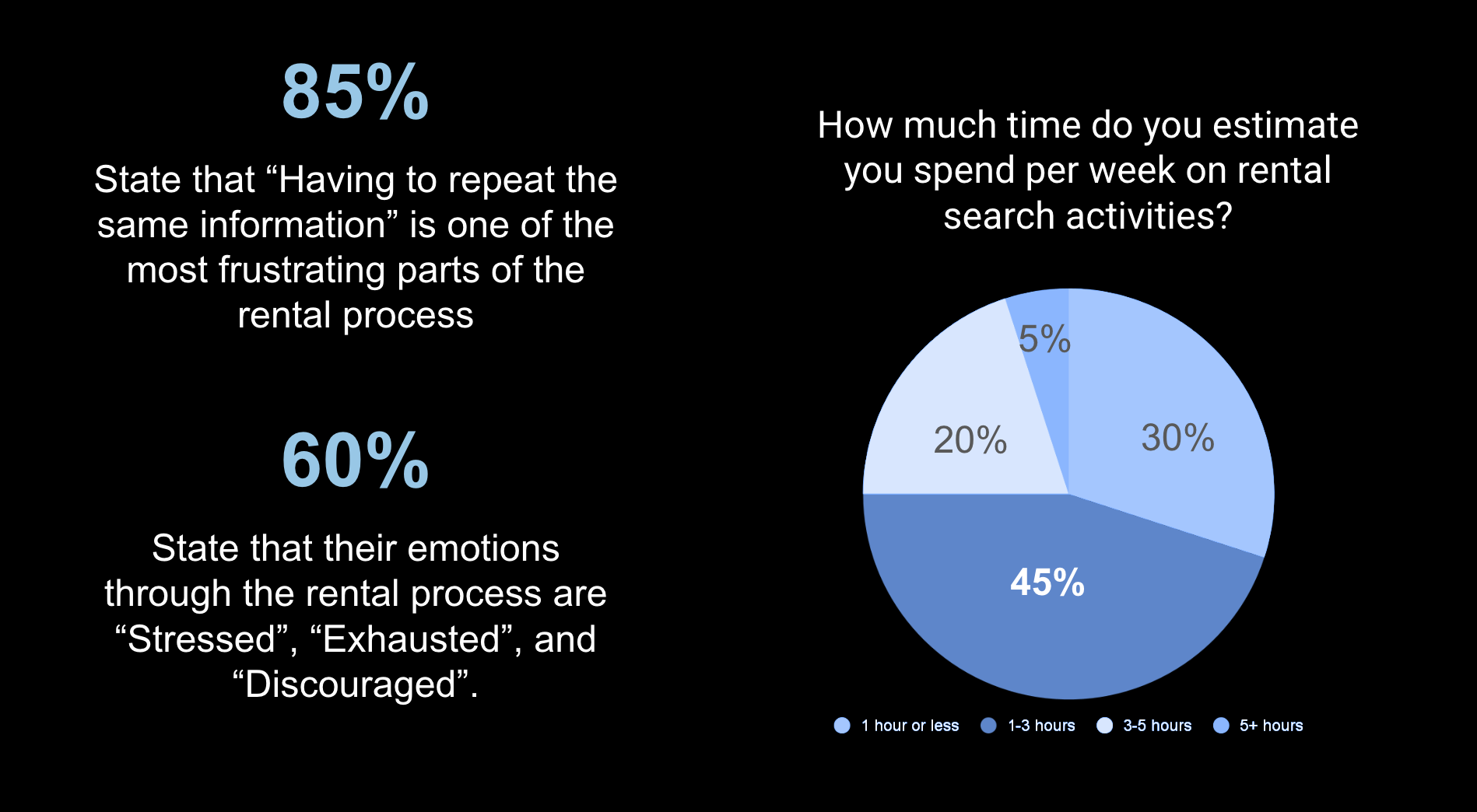
Afterwards, I conducted comprehensive research combining quantitative surveys (n=20 participants) and qualitative interviews (n=4) to understand behavioral patterns, pain points, and communication preferences in rental processes.
For the quantitative surveys, I started off by asking about specific ways people go about their rental search, and then went further to ask about their emotional response to the rental process including scheduling, contacting, and viewing properties.
Research Takeaways
Timing is Critical
Users emphasized that rental markets move extremely quickly with successful applications often submitted within hours of property listings. Current communication delays can mean missing opportunities entirely, and users state they spend around 1 to 5 hours scheduling and messaging property managers a week.
Users want action, not repetition
Users explained that the most frustrating part of their search is having to repeat the same information to many managers in order to narrow their list. This creates an unpleasant experience when searching for a property that matches their needs, which may lead to them ultimately abandoning their search online.
Renters feel stressed and exhausted during the search process
When renters were asked about the main emotions they face, they stated they felt stressed, mainly from the overwhelming amount of actions they have to take towards the rental process. They also felt exhausted, since the amount of communication required to contact a property manager in a short amount of time causes message fatigue. Lastly, they feel discouraged, with notes of feeling loss of hope in the situation they are in. This can be due to the feelings of loss when a property becomes not available in a short amount of time.
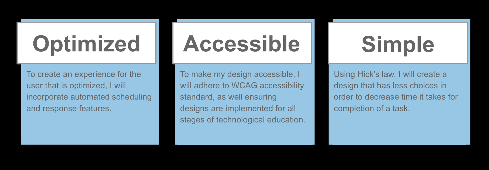
Design Goals
I strived to create a mobile platform that combines scheduling, personalized communication, and automated workflows to reduce the negative emotions users feel towards the rental process, with my goals focused on the following.
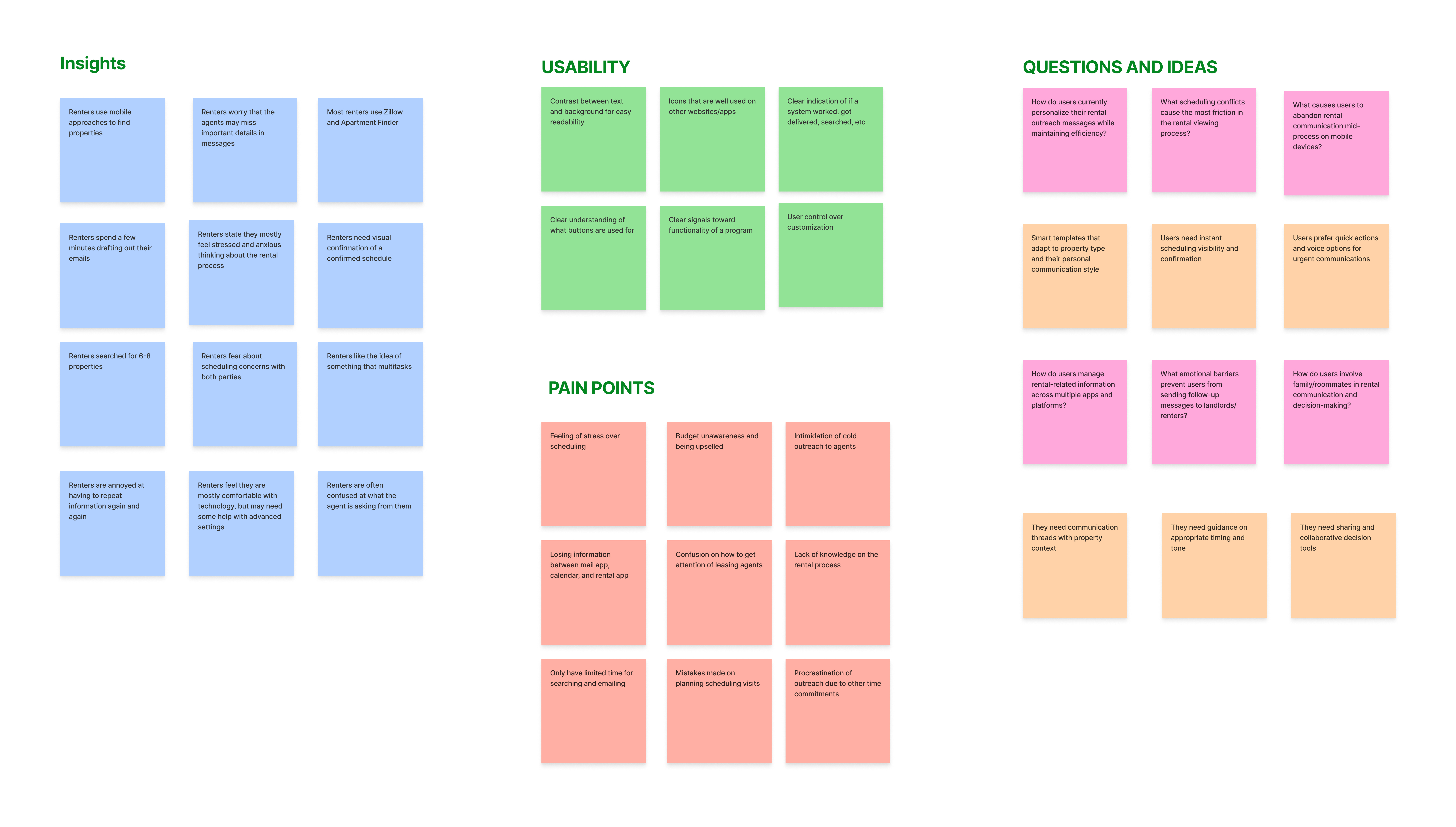
Affinity Mapping
Afterwards, I organized my research insights into clusters focusing on user challenges and painpoints, usability and accessibility, and specific questions and ideas that I need to consider to identify core design opportunities.
User Personas
Using my research from the questionnaire, I created two user personas, Jordan and Sarah, to conceptualize my target audience's pain points, emotional needs, and overall view towards the rental process.
Ideation Phase
User Flows
I then mapped user journeys from initial app onboarding through successful rental communication. While creating this journey, I was focusing on reducing cognitive load and minimizing steps required for certain tasks.
The onboarding flow prioritizes quick setup while gathering essential personalization data. The main app flow emphasizes immediate access to communication tools and scheduling features, with secondary features easily accessible but not interfering with the primary workflows.
Low Fidelity Wireframes
The first wireframes focused on information architecture and functionality placement.
I wanted to create a clear guideline for how the onboarding process and main app functionalities would look. I focused mostly on what features I would want and how they would be optimized on the screen.
A/B Testing and Iterations
Onboarding Progress Indication
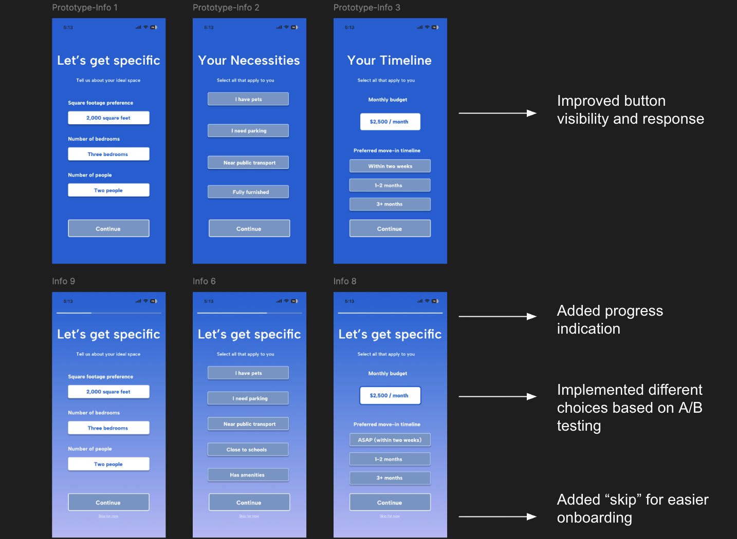
Version A (Original): Clean, minimal onboarding screens without progress indication
Version B (Revised): Added progress bar showing completion status throughout the flow
This improvement aligns with the Goal Gradient Effect, a UX principle showing that people are more motivated to complete tasks when they can visualize their progress toward a goal. The progress bar provides users with a clear mental model of where they are in the process and how much effort remains, reducing cognitive load and completion anxiety. For rental apps where users often multitask during setup, this visual progress indicator is crucial for maintaining engagement.
Educational Content Integration
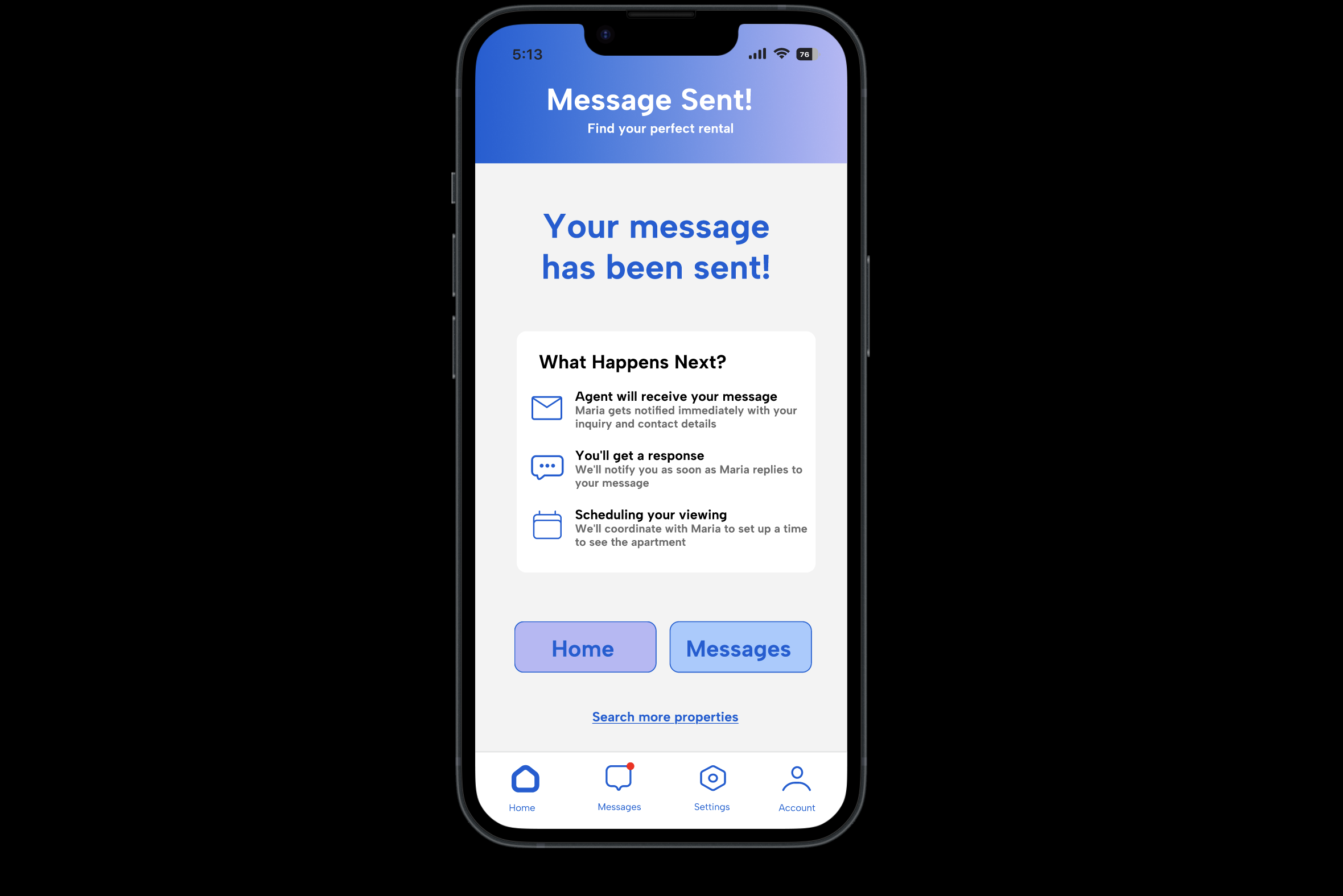
Additional Screen: Added "What Happens Next?" educational card explaining the rental process from the property manager's perspective.
This addresses the Uncertainty Reduction Principle, which states that people have a need to reduce uncertainty in their interactions. Many users are unaware of the rental process on the manager's side when messaging back, leading to anxiety and confusion about response times and next steps. By educating users about what to expect, it can reduce cognitive load, set appropriate expectations, and build trust in RentailMail.
Status Visibility Enhancement
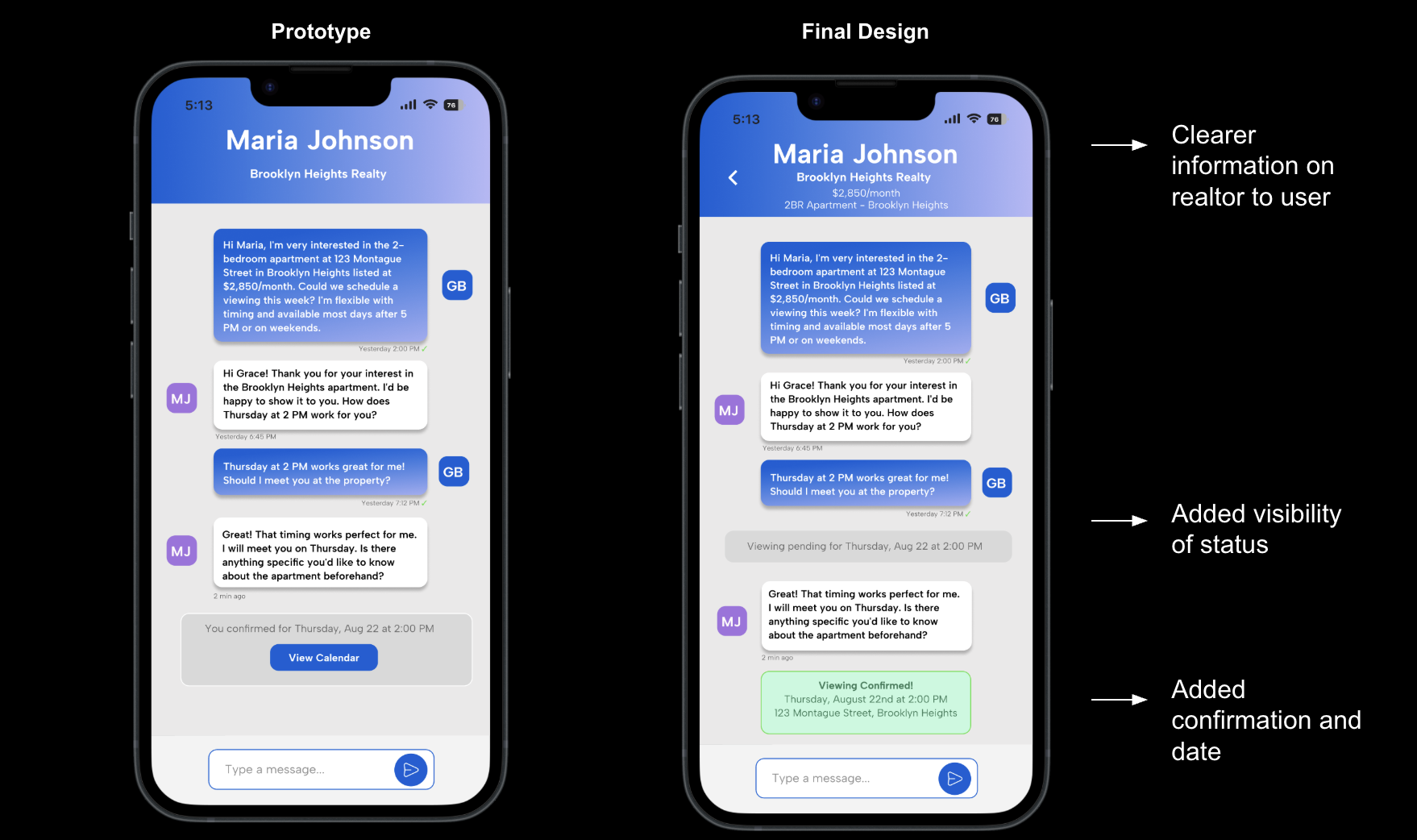
Version A (Original): Standard messaging interface with text-based confirmation in conversation thread
Version B (Revised): Added prominent "Viewing confirmed" status boxes within the messaging interface
This improvement follows the Feedback Visibility Principle from Nielsen's Usability Heuristics, ensuring users can clearly see the system status at all times. Users want to know exactly when managers confirm viewings through not only a message, but a confirmation from the app itself on the messaging screen. The visual status provides immediate feedback that makes critical information easily accessible.
Final Design Solutions
Onboarding Process
The first process of the onboarding process introduces the users to RentailMail's specific properties, including emailing leasing agents, as well as automated scheduling and messaging. The onboarding process then proceeds to get to know the user, asking questions based on square footage, important factors, budget, and preferred timeline. Lastly, RentailMail asks to connect with Google Calendar for easy scheduling.
The key UX principles implemented include clear value communication, and immediate usability upon core information completion.
Home Page
The home page design prioritizes quick access to the link searching functionality through navigation and visual hierarchy. This is why the search function is placed at the top on the home screen. RentailMail then searches, with a loading screen shown to the users to allow for clear visibility in the app's process. After the property is loaded, the screen shows details about the specific property, as well as an option to save it for later, or message the agent. After the user chooses to message the agent, the property inquiry page shows the automated message. This page allows for customization from the user through specific messaging details, such as "Schedule viewing", "Ask questions", or "Ask to apply". This screen also asks if the user wants their contact information to be shared. Lastly, a "sent message" screen appears. A card explains the next steps to the rental process, as well as options for the home screen, messaging screen, and searching other properties.
The integrated calendar view and property link functionality reduce app-switching and support users who need quick, focused interactions with the platform. This is supported by clear use of colors to symbolize a date is important, as well as a focused list of information the user may need: date, time, address, and agent name.
Messaging
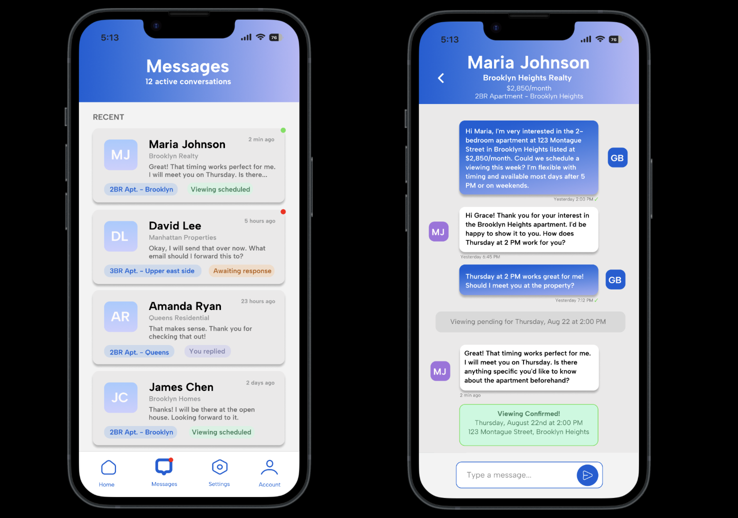
For users with specific, limited purposes, such as Jordan who may only need to schedule a single viewing or Sarah who requires fast coordination for multiple properties, the design supports both focused patterns and scattered patterns. The first messaging screen shows clear indicators of what each message contains, such as what apartment the agent is attached to. Additionally, the messaging screen shows the status of the conversation. This can be seen through the green, orange, and purple text boxes attached to each message preview. In the specific message conversation thread, the Viewing Scheduled and Viewing Confirmed status indicators provide immediate visual feedback using color psychology to allow users to quickly scan their active conversations without reading through entire message threads. This progressive information disclosure approach ensures that casual users can accomplish their specific tasks efficiently.
Settings and Account
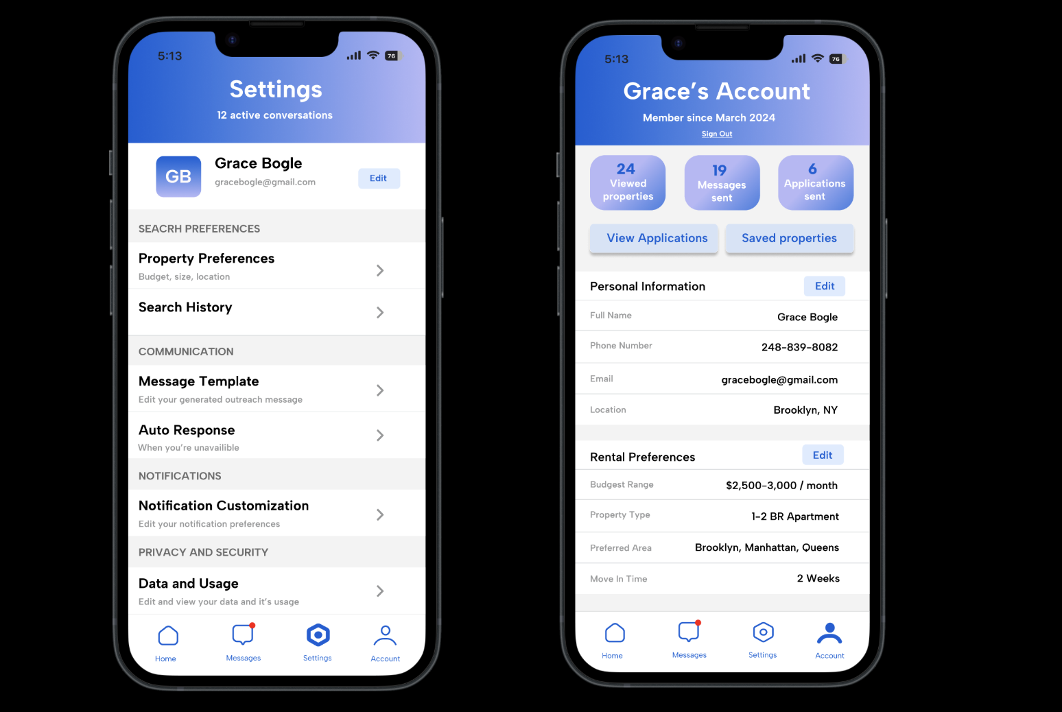
The Settings screen prioritizes frequently accessed controls like Message Templates and Auto Response features, while the Account screen provides comprehensive activity tracking through visual metrics (24 viewed properties, 19 messages sent, 6 applications sent) that help users understand their rental search progress. The other key features like Rental Preferences editing and Personal Information management use consistent visual patterns to ensure that users can quickly update their search or contact details as their housing needs change. This efficiency of use principle is particularly important for rental apps where user circumstances and preferences change throughout the search process.
Project Outcomes
RentailMail successfully addresses the emotional and messaging barriers in rental communications through a mobile solution that balances automation with personal connection.
Enhanced Personalization
Developed smart messaging templates that maintain authentic communication tone while creating specific outreach. This solves the tension between personalization and time constraints that users reported.
Improved Accessibility for Diverse Users
Created an interface that serves both inexperienced renters like college students and busy professionals through progressive disclosure and flexible interaction patterns.
Communication Workflow
Created a platform that eliminates the need to switch between multiple apps, reducing the average time from property discovery to initial outreach through automated messaging templates and calendar integration.
Key Reflections
Research Drives Better Design Decisions
The user research phase was invaluable in identifying the emotional states of rental searching that functional solutions miss. I was glad to understand that users felt "stressed," "exhausted," and "discouraged", and it led to design decisions focused on confidence building and transparency.
Mobile-First and Overall Experience
When I was designing primarily for mobile interactions, I wanted to ensure it was more focused with user flows that benefited the entire experience. The constraint of limited screen area led to better information prioritization, clearer visual hierarchy, and more intuitive navigation patterns.
Iteration Through Testing Reveals User Behavior Gaps
The A/B testing phase uncovered significant differences between assumed user preferences and actual behavior patterns. For example, users responded much more positively to explicit progress indicators and educational content than initially expected, suggesting that transparency and guidance are more valuable than minimalist interfaces in high anxiety contexts like housing searches.
Balancing Automation and Authenticity
One of the project's most challenging aspects was creating automated systems that still felt personal and genuine. The solution of contextual templates with customization options needed to maintain efficiency while preserving user control in communication tone. However, this required careful attention to copy writing, user control options, and feedback to ensure users felt empowered by automation.
View More Projects
Patient Portal User Research & Insights
Healthcare UX research combining ethnographic interviews and quantitative analysis for digital medical portal optimization.
View Project
Accessibility Audit Case Study: Zingerman's Deli
Comprehensive WCAG 2.1 compliance assessment and digital inclusivity analysis for local business website.
View Project
Improving Community Platform Usability
UX research and design improvements for neighborhood social platform, focusing on information overload reduction.
View Project